USE Coupon USA10 For 10% OFF
Days
Hours
Mins
Secs
USE Coupon USA10 For 10% OFF
Days
Hours
Mins
Secs



Remember the last time you stood in your kitchen, coffee in hand, imagining how different it could look? That’s where we meet today – at the crossroads of “what is” and “what could be.” Your cabinetry isn’t just storage; it’s the soul of your kitchen. When done right, it tells your story through color and texture.
This year’s design trends reveal something beautiful: homeowners are embracing nature-inspired elements that stand the test of time. Rich wood tones have become the new neutral, offering warmth that white cabinets simply can’t match. The right color pairings don’t just complement your existing features – they reinvent your entire space.
We’ve helped over 200 families transform their kitchens using these exact strategies. One client told us her updated space “feels like a warm hug every morning” – that’s the power of intentional color choices. Whether you’re drawn to cozy earth tones or crisp modern accents, your perfect palette is waiting.
There’s a reason certain design elements never fade from popularity—they simply evolve. Wood cabinetry has anchored homes for generations, blending practicality with enduring style. Today’s resurgence of earthy tones proves that what feels classic can also feel fresh.
Mid-century ranch homes and 1970s retro spaces both relied on wood’s natural warmth. Fast-forward to 2024: designers report a 40% increase in requests for organic materials. This isn’t nostalgia—it’s a conscious choice to create spaces that balance tradition with contemporary needs.
You’ll notice these tones work equally well in open-concept lofts and cozy cottages. They pair effortlessly with stone countertops or metallic finishes, proving their adaptability. As one designer told us, “Wood grain tells a story that flat paints can’t match.”
Rich hues mirror elements found in nature, creating instant comfort. They hide wear better than light colors while adding depth to your room. Unlike bold accent walls that date quickly, these shades provide a neutral backdrop for rotating decor trends.
Homeowners love how wood tones make spaces feel lived-in yet polished. They’re also sustainable—many opt for reclaimed materials or eco-friendly stains. Whether your style leans minimalist or eclectic, this foundation ensures your space ages gracefully.
The magic happens when your cabinetry color meets its perfect match. Whether you crave earthy warmth or sleek modernity, these combinations unlock your space’s full potential.

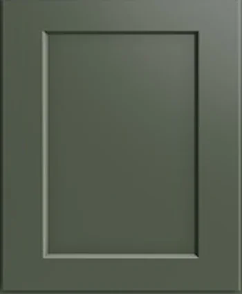
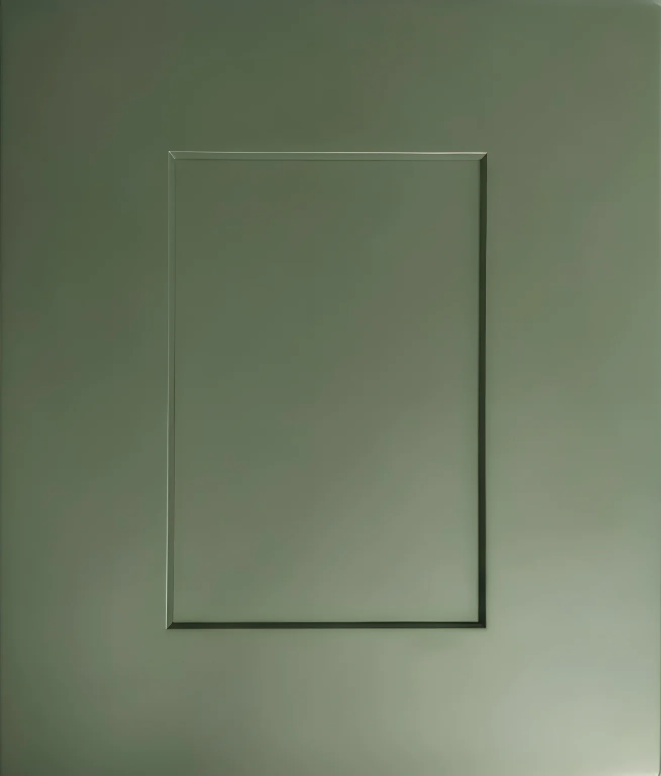
Soft beige walls create instant harmony with wood finishes. Picture morning light glowing through windows onto a sage green backsplash – it’s like bringing the outdoors in.
Muted terracotta adds depth without overwhelming. Pair it with warm gray flooring for balance. These tones work particularly well in homes with natural stone countertops or woven textures.
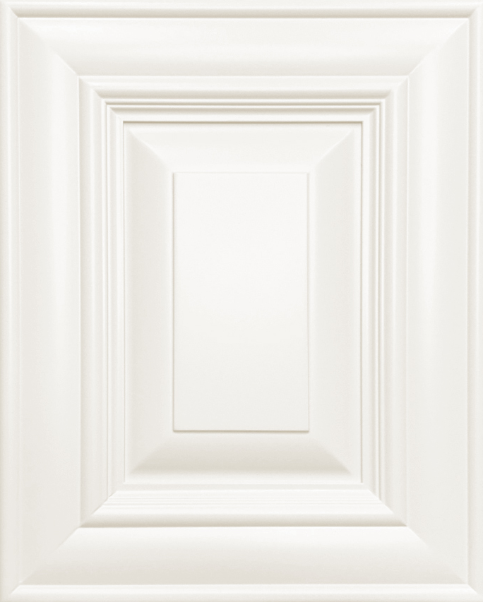
Crisp white makes your space feel airy and expansive. We’ve seen it transform cramped cooking areas into bright, inviting hubs. For added dimension, try dove gray walls with charcoal tile floors.
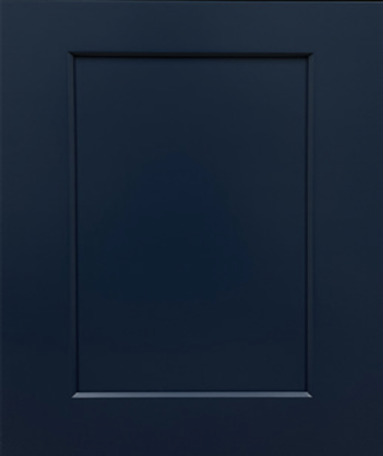
Navy blue delivers unexpected sophistication. One client told us, “It feels like our kitchen grew up overnight” after switching to this bold combo. The key lies in balancing cool accents with warm metallic finishes.
Transforming your cooking space starts with understanding color relationships. The right combinations can elevate your design from ordinary to extraordinary while enhancing functionality. Let’s explore how to create visual harmony that feels both intentional and effortless.

Natural light plays starring role in your color decisions. Sunlit spaces handle deeper accents beautifully, while rooms with fewer windows benefit from airy neutrals. Test swatches at different times – morning glow and evening lamplight reveal surprising shifts.
Undertones matter more than you might think. Warm reddish hues pair well with creamy whites, while cooler grayish tones shine alongside soft blues. One client discovered their “walls looked pink until we adjusted the accent tiles” – a lesson in careful coordination.
| Lighting | Recommended Colors | Finish Types | Mood |
|---|---|---|---|
| Ample Natural | Forest Green, Spiced Orange | Matte, Glossy | Dramatic |
| Limited Natural | Pearl White, Pale Butter | Satin, Eggshell | Airy |
Consider emotional impact when selecting shades. Warm beiges foster cozy gatherings, while crisp grays establish sleek modernity. Our team helped a family balance these elements using textured window treatments and layered lighting.
For personalized solutions tailored to your space, call 703-451-6000. We’ll help you navigate finishes, materials, and layouts to create your ideal heart-of-the-home experience.
Small details make the biggest impact in design transformations. Swapping out dated handles and fixtures can redefine your space faster than a full remodel. We’ve seen clients achieve dramatic results simply by focusing on functional jewelry for their cabinetry.

Chrome bar pulls bring sleek modernity to traditional layouts. One homeowner shared, “Our space felt instantly newer without replacing a single cabinet.” Pair these with stainless steel appliances for a unified, professional look that brightens the room.
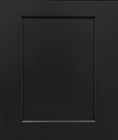
Oil-rubbed bronze offers timeless warmth. It’s perfect for maintaining cozy vibes while adding subtle sophistication. For those craving bold contrasts, matte black fixtures create striking focal points against rich wood tones.
| Finish | Style | Pairing Tip |
|---|---|---|
| Brass | Luxury | Use with warm-toned lighting |
| Chrome | Contemporary | Match to appliance surfaces |
| Black | Dramatic | Balance with light countertops |
Gold and brass finishes have surged in popularity, offering affordable luxury through small accents. Remember: cohesive finishes matter more than matching every piece exactly. Mixing metals can work if you maintain consistent undertones.
Stainless steel remains the top appliance option for its versatility. The reflective surfaces bounce light around your space, making it feel airier. For personalized guidance on harmonizing finishes, call 703-451-6000 – we’ll help you curate choices that elevate your entire design.
What if your walls could whisper design secrets? The right surfaces become conversation starters while tying your entire space together. Let’s explore how to turn functional areas into focal points that elevate your room’s personality.

Herringbone layouts add dynamic energy with their zigzag rhythm. Neutral-toned tiles in this pattern create movement without competing with wood finishes. One homeowner told us, “Guests can’t stop touching the textured surface – it’s art you can use.”
Classic subway tiles remain a crowd-pleaser for good reason. Their clean lines reflect light beautifully, making compact areas feel airier. For contemporary flair, try hexagonal or diamond-shaped geometric designs in muted earth tones.
Marble slabs bring instant luxury with their natural veining. These statement pieces work particularly well behind stoves or sinks. If commitment worries you, peel-and-stick options now mimic high-end materials convincingly. A recent client marveled at how removable tiles gave their space “five-star hotel vibes overnight.”
| Backsplash Type | Best For | Light Effect |
|---|---|---|
| Glossy Tile | Small Spaces | Amplifies brightness |
| Matte Stone | Large Walls | Softens harsh light |
| Metallic Accents | Modern Designs | Creates focal glow |
Don’t underestimate vertical expansion. Running tiles to the ceiling draws eyes upward, creating illusion of height. Pair this trick with under-cabinet lighting to make colors pop during evening hours. Need help visualizing options? Call 703-451-6000 – we’ll send samples matching your exact wood tones.
What makes a space feel both grounded and inviting? The answer lies in nature’s blueprint. When working with rich-toned cabinetry, layering organic materials creates depth while maintaining modern appeal. Think of your room as a forest clearing – every element should contribute to the harmony.

Hardwood floors anchor the design, their grain patterns echoing cabinet textures. Exposed ceiling beams draw eyes upward, adding architectural interest. A reclaimed wood island becomes the heart of the space, its weathered surface telling stories of past lives. Pair these with glossy subway tiles for contrast – their reflective quality keeps things fresh.
Stone countertops offer more than durability. Marble’s swirling veins or quartzite’s speckled patterns become natural art pieces. One client marveled, “Our granite surface changed how we use the room – it’s functional sculpture.” Metal accents prevent heaviness – try brass pulls that catch light or matte black pendants with clean lines.
Don’t overlook subtle touches. Bamboo drawer inserts add earthy texture under sleek hardware. Concrete planters with herbs bring life to windowsills. The secret? Layer materials vertically – stone backsplash, wood cabinets, metal lighting – to guide the eye naturally.
Reclaimed floating shelves showcase heirloom dishes while adding character. These elements work best when balanced – too much wood feels cabin-like, while excessive metal reads cold. We’ve found success using the 60-30-10 rule: 60% dominant material, 30% secondary, 10% accents.
For personalized guidance blending these elements, call 703-451-6000. Our team helps you create spaces that feel both timeless and distinctly yours – where every material has purpose and poetry.
Ever feel like your cooking area needs a breath of fresh air without losing its cozy charm? Two-tone designs answer this modern dilemma beautifully. By blending contrasting shades, you create visual rhythm that keeps eyes moving while maintaining harmony.

Pairing deeper base units with crisp upper storage creates natural balance. This approach makes ceilings appear taller while keeping the room grounded. One homeowner shared, “Our once-cramped area now feels like it gained square footage overnight.”
White upper units reflect natural illumination, brightening workspaces. Use this contrast to highlight architectural features like arched hoods or glass-front storage. The mix also lets you experiment – try matte finishes below and glossy surfaces above for subtle texture play.
Strategic placement prevents visual heaviness. Keep richer tones below eye level and lighter shades higher up. Complement with mixed materials like marble countertops or metallic handles that bridge both worlds.
| Element | Color Choice | Effect |
|---|---|---|
| Island | White with wood trim | Creates focal point |
| Backsplash | Neutral mosaic | Ties both tones together |
| Hardware | Brass handles | Adds warm contrast |
We’ve found success using this formula: 60% primary tone, 30% secondary, 10% accents. For personalized guidance achieving your perfect mix, call 703-451-6000. Our team helps you craft spaces that feel both fresh and familiar – where every choice tells your story.
Custom features turn ordinary storage into your kitchen’s secret weapon. Imagine metal open shelves displaying heirloom dishes where upper cabinets once loomed. These airy alternatives create visual breathing room while keeping essentials within reach. Pair them with specialized wine racks that blend storage and style – perfect for entertaining.
Struggling with awkward corners? Smart corner storage solutions like rotating trays or pull-out drawers maximize every inch. We’ve seen clients gain 30% more usable space simply by rethinking these neglected areas.
Your remodel should reflect how you actually live. Deep drawers with dividers keep pots organized, while vertical tray slots tame baking sheets. These upgrades work quietly behind the scenes, letting your design shine without clutter.
Ready to transform your space? Call 703-451-6000 for expert guidance tailored to your needs. We’ll help you craft solutions that marry beauty with purpose – because your kitchen deserves both.
Warm neutrals like cream or soft beige create balance, while bold jewel tones (emerald green, navy) add drama. Cool grays or icy blues offer modern contrast against rich wood finishes.
Pair deeper tones with light countertops, reflective surfaces like stainless steel, and ample lighting. Open shelving or glass-front doors also break up visual weight effectively.
Yes! Combine darker base cabinets with lighter upper units or a natural wood island. Stick to complementary undertones—warm walnut pairs well with golden oak, while espresso works with ash grays.
Brushed brass or matte black pulls add contemporary flair. For transitional styles, try oil-rubbed bronze or satin nickel—they bridge classic and modern aesthetics seamlessly.
Absolutely. Pairing deep espresso lowers with crisp white uppers remains popular. This approach adds depth while keeping the room airy—perfect for smaller kitchens.
Stone countertops, woven barstools, or metal light fixtures add texture. These elements highlight the organic warmth of wood while introducing functional elegance.
Subway tiles in neutral hues keep focus on the cabinets. For bolder looks, try geometric cement tiles or vertically stacked marble—they create movement without overwhelming the space.